 Intro and Connections with Course Content: (3) When deciding on what to research for this week’s blog assignment, I thought about the multimedia design principles that intrigued me most this semester. These included Mayer's design principles. During week seven, I realized that while I thought I knew how to effectively select and design presentations like PowerPoints and Prezis, I was actually violating the multimedia and modality principles! In one of my MMP updates, I even commented on one of my “failed” Prezis. Then in another update, I shared a glimpse of my newly Mayer-improved PowerPoint. However, this week, I wanted to make sure that I definitely understood his principles and applied them correctly. Therefore, I researched Mayer and found a study by Tabbers, Martens, and van Merrienboer, entitled Multimedia instructions and cognitive load theory: Effects of modality and cueing. Summary of Main Points: (1) This study explores the generalizability of Mayer’s modality and signaling (cueing) principles. It points out that previous studies, which replicated the modality and cueing effect, have some features that make its generalizability questionable. For instance: - They mainly taught a technical subject.
- The instructional time (duration of multimedia/presentation) was brief.
- They were mainly system-paced.
- The studies took place in a laboratory setting.
Therefore, this study included instructions that: - Taught a non-technical subject (instructional design).
- Lasted for more than an hour.
- Were tested in a traditional classroom setting.
The participants: - First watched four different versions of the instructions. Those with:
-visual text and cues in the diagram -visual text and no cues in the diagram -audio text and cues in the diagram -and audio text and no cues in the diagram. - Then took retention tests and transference tests.
- Finally completed self-assessments, which discussed their levels of effort during each part of the process.
Overall, the study reported that students performed better on the tests when they had viewed the instructions with visual text. This contradicts Mayer’s (and other referenced studies’) results. Here are a few reasons why: - The study pointed out that perhaps, Mayer’s principles are not generalizable if the instructions are longer. Listening might be more boring and tiresome if the audio spans the course of an hour as it did it this study. Attention span and focus might be factors when the text is longer. Therefore, the modality effect may only exist if the segment is short.
- Also, the researchers posit that the conditions in the environment can have an influence on effectiveness. For instance, the audio took a long time to download because the Internet was slow, and so students might have been discouraged by the wait time. This is more common of a regular classroom rather than a lab-controlled study, and therefore the bimodal effects observed in studies like Mayer’s are not generalizable.
- Finally, how the instructions are paced could influence how effective the visual text is versus the audio text. When instructions are learner-paced, students can integrate visual text with images better because they have more time to go back and forth between the two and actually absorb content. This factor takes away from the dual-modality effect observed in previous studies.
Reflection on Relevance to our Course (2): This study was really interesting and definitely relevant to our course. I originally chose to read this to learn more about Mayer’s principles and found it by searching for scholarly articles on Mayer’s design principles in general. After reading the abstract, I thought that it might be interesting to see if the study could replicate Mayer’s ideas on modality and cueing more specifically. Overall, by reading this article, I learned to question the conditions that make the principles valid. Article (4): If you would like to read the article explained above, you can access it via Rutgers Library: http://search.ebscohost.com.proxy.libraries.rutgers.edu/login.aspx?direct=true&db=aph&AN=13276049&site=ehost-live&scope=site&lang=en
 Being Critical with Brand New Eyes
As an eighth grade language arts teacher, I am constantly thinking about how to teach my students to be critical readers. When reading any piece of text, I want them to question the purpose and the intended audience, detect the tone and potential bias, and determine reliability and validity. I know that if I can teach them to be critical readers, they will easily learn to become critical writers and produce writing that is intentional and strategic.
There’s no doubt that the goals that I set forth in my language arts class and the goals that are set forth in our class are one and the same. Through this course, I am learning to become critical as a viewer and consumer, and in turn, I am learning to critically select and design media as an educator. Now, because I am studying the vocabulary and tools of web-based multimedia design, I am learning to become intentional and strategic.
As I reflect back upon my blog posts, I realize how much I have truly learned. When reviewing my post about the Palmolive commercial, I noticed that when I tried to discuss the “design” of the commercial, I really wasn’t discussing much about design at all. I didn’t discuss the sequence of shots that were intentionally planned out in the storyboard or what the camera zoomed in on in each shot. Needless to say, my perception of what is meant by the word design has definitely changed since then.
Before joining online communities as the first step of my MMP, I only ever thought about finding information online by using search engines and online databases. I never realized that there are professional networks online to which I could belong. Now, online communities are yet another resource, a place to post questions, gather ideas, and even attend webinars. I particularly like English Companion because of the additional information I am obtaining on the new Common Core Standards.
As I reflect back on my first Mini-Art School post, I am just embarrassed by the way I posted my designs! I realize that the post itself includes images that are way too large and text that looks microscopic in comparison. I also know that I have loads of unnecessary white space, and it is difficult to determine which image goes with which explanation. The exercises themselves taught me that in the past, I committed many, many design sins, and from Mae-Lin’s comments, I learned that in fear of committing any more in my revised version, I scaled back too much. Now, I think I have the tools to avoid committing design sins without stripping my designs of all interesting elements. I can find a happy medium (which I hope to achieve in my MMP).
I had loads of fun with the second and third Mini-Art School posts! I truly enjoyed discussing the images from the Library of Congress, and what was even more enlightening was the fact that you could even search images in this way! I also thought that analyzing the voice of each font in the second assignment was truly enjoyable. While I instinctively knew that there was a look and feel to each font, I never really thought about the idea that fonts could actually contradict concepts.
Similarly, I really appreciated the exercises in the last mini-art school blog assignment. I learned about using Fotoflexer from a classmate’s Mixed Digital Media Critique, and I used it for my cropping and border exercises. I found it interesting to learn that cropping completely changed the perspective in the photo and the borders really added or detracted from their character.
Finally, my last blog post was really useful because it helped me determine a concrete plan for my MMP. Ali helped confirm the idea that keeping a similar format to each page on my site was a good idea and would be helpful to the students who need consistency. Brandi’s comments regarding some of the issues that she ran into while using Weebly, the site which I am using for my MMP, were also really valuable. They helped me to remind my students to use only their first names and to definitely double-check grammar and spelling. In fact, watching Brandi develop her Weebly site over the course of her project has inspired me to play with different formats and even add columns. I didn’t even know Weebly offered that function until I saw her use them! Regarding the second part of this blog post, creating the sixty-second video was also really empowering! I finally overcame my fear of iMovie and learned how to edit music to fit the short clip. I can’t wait to use it again to arrange pictures that I recently took on a field trip and post it on my site to increase traffic (ultimately directing them to important information related to my MMP).
When I looked back at the overall feel and look of my blog and then reviewed the site I am developing for my MMP, I realized that I am certainly growing. I will continue to avoid design sins as I go forward with the development of my site, and I even hope to teach some of the design principles to my students who are struggling with layout, use of white space, readability of fonts, and warped photos. I look forward to my classmates’ invaluable feedback and improving even further throughout the implementation of my project.
MMP Story Board  | click_here_to_download_the_story_board.png | | File Size: | 32 kb | | File Type: | png |
Download File
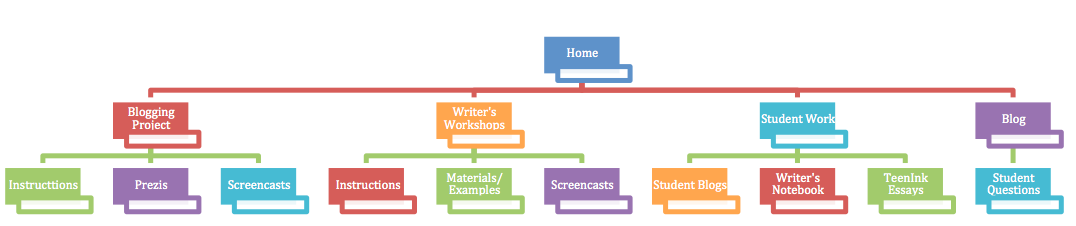
As stated in White Space Is Not Your Enemy, once you have a project "you have to think about how to tell the story shot by shot." Therefore, when planning my site, which will host all of the necessary information that my students need to complete their argument blogs and essays, I thought of how my lessons will be carried out, step by step. My story board/site map is very basic at the moment. Since my project involves two student projects, I decided to dedicate one page to their blogging project and one page to the development of their essays (writer's workshop). Since students will need a way to see one another's blogs and TeenInk essays, I decided to dedicate one page to post their work. Finally, I included a blog page at the end so that students can post questions here. Note: Since screencasts are movies, I'm also thinking about planning a story map for my screen casts.
Concept in Sixty Video
For my concept in sixty video, I decided to use photos I took when I visited Carlo's Bakery in Hoboken. I am really excited because I have finally conquered my fear of iMovie as a result of completing this project! I was able to crop my images, use effects to alter color and blur out edges, select transitions, and edit my audio file. I carefully chose "Animal" by Miike Snow to play during my movie for two reasons. 1. The song is happy and upbeat, feelings I associate with treats and a bakery and 2. It's ironic because the lyrics say "I'm still an Animal." Even though I might be happy eating those sweets, I can still feel like an animal when I give into my cravings!
Thanks to a classmate's recommendation for an online photo editing program, I used Fotoflexer for all of the exercises below.
Cropping Exercise: page 193 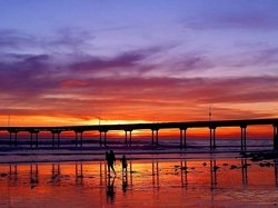 ORIGINAL Colorful Beach
This image reflects a beautiful beach scene. The focus seems to be on the colors in the sky and the bridge that divides the image. There's also a family on the beach in the lower portion of the image. This could be considered a focal point and is made clearer in the first cropped image below.
 CROPPED Colorful Beach #1
In this cropped version, I made the focal point the family on the beach. The fact that the family is off to the left draws your eye and makes you pay attention to them.
 CROPPED Colorful Beach #2
I like this version that I cropped the most best because the balance is off. The bridge doesn't divide the image in half. Instead, it remains in the lower portion. The sky consumes the rest of the photo and is the undeniable focal point.
 ORIGINAL Graffiti
I thought this image was really cool. There's so much visual energy and movement. It's so chaotic and that's part of what makes it interesting.
 CROPPED Graffiti
By cropping this section of the image, I drew attention to a part of the wall that might have been obscured otherwise.
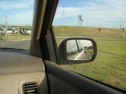 ORIGINAL Rear View Mirror
A lot of people take pictures of images in their rear view mirror, so I found this one that would be improved with a little cropping.
 CROPPED Rear View Mirror
In the original image above, I found the part of the image that shows the interior of the car unnecessary. Therefore, I removed it and only focused on the rear view mirror. Now you can focus on the traffic reflected in the mirror.
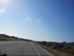 ORIGINAL Driving to Pebble Beach
This is a photo that I took as my friends and I were driving to Pebble Beach. It's difficult to find a focal point in this image.
 CROPPED Driving to Pebble Beach
By cropping the photo in this way, the view becomes more panoramic. The focal point seems to be the end of the road or where the road leads, depending on how you look at it.
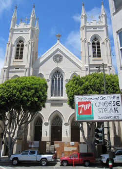 ORIGINAL Church in San Francisco
This is a photo I took of a church in San Francisco.
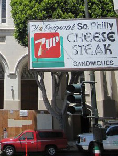 CROPPED Church in San Francisco
I cropped the photo to focus on the Philly Cheese Steak sign. I thought it stood out in the original, so cropping it in this way emphasized this ironic sign. Get it? Original Philly Cheese Steak in San Francisco? :)
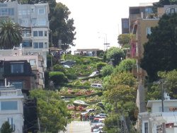 ORIGINAL Hill in San Francisco
Here is a photo I took of a famous landmark in San Francisco.
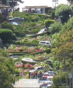 CROPPED Hill in San Francisco
By cropping it in this way, I removed the unnecessary buildings so that you could see the cars winding down this curious hill.
Border Variation Exercise: page 197  Looking through all of my photos from San Francisco made me think about my travels, and when I came upon this exercise, I thought about when I travelled to Mykonos, Greece. I couldn't find the photos that I took there, so I found a photo online.
 I used blurred edges for this border. It draws the eye inward.
 I used a circular border for this version. The shape echoes the contour of the coastline.
 I used a thick, dark blue border for this version. I chose dark blue to echo the dark blue tones in the mountains.
 For this version, I used photo edges. It's fun, and it looks like it belongs in a scrapbook.
 This blurred border waters down the colors along the edges. It makes the picture look dreamy.
Conveyance Exercise: page 299  For shred, I used brush strokes to "shred" each letter.
 For lightly, I used an airy font and placed the word in a cloud, which is perceived to be light.
 For atom, I used an image of an atom for the O.
 Similarly, for brick, I used an image of a brick wall for the I.
 For pillow, I used glittery, light blue letters. I associate light blue with the sky, dreaminess, and sleep.
 For XXL, I used bold capital letters. It screams extra large.
Assignment #1:
White Space is Not Your Enemy, pg 56 #2
Go online to visit the Library of Congress Prints & Photographs Reading Room at http://www.loc.gov/rr/print. Click around until you find several very different photographs you really like. Use the elements and principles of design to explain why you like the phones. Church of the Resurrection (1686-94), southwest view, Matigory, Russia
This photograph of the Church of the Resurrection is beautiful for many reasons. For one, I like the different types of lines created by the contrasting shapes in the church. These contrasts are created by the cylinder of the tower, the brown bulbous shapes at the top, the points of the crosses, the triangular shapes of the roof, and the square sides of the building. Speaking of contrasts, the blue in the sky contrasts nicely as it meets with the tan color of the building and the stark white of the snow. The texture created by the raised snow adds to the photo as well.
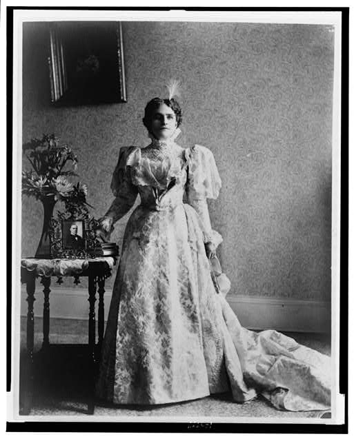
Ida S. McKinley, full-length portrait, standing, facing front
This photo of Ida S. McKinley is stellar for two reasons: texture and balance. The texture in the lace and print of her dress is gorgeous. There is an obvious texture in the wallpaper as well created by different variations of grey. Also, since both the dress and the wallpaper include texture, it is clear that texture might actually create a pattern in this image. Finally, there is a clear sense of asymmetrical balance in this photo. She is centered, but there are a greater number of objects to her right. This is balanced by a greater amount of negative space on the wall to her left. The painting on the wall to her right also seems to be balanced by the train of her dress laying on the floor to her left.
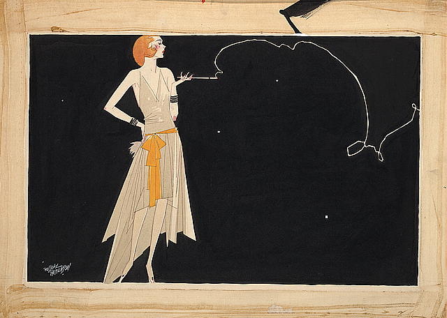
Where there's smoke there's fire
This print is interesting to me because of its inherit movement. Even though the focal point in the image seems to be the woman, my eye is immediately drawn to the swirling line of smoke coming from her cigarette. While this seemed strange to me at first, the fact that this line creates movement justifies my gravitation toward it. Also, I find the muted colors attractive. The cream of her skin and beige of her dress serve as a nice contrast to the black background against which she is set.
Assignment #2:
Design Basics Index, pg 241
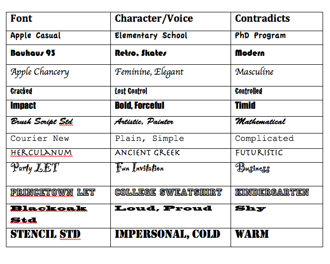
Select a dozen or so contrasting fonts from your collection. Look them over and consider the "voice" that is conveyed through their characters. For each font, come up with two words whose meaning is amplified when presented in that particular font. Next, find a word whose meaning directly contradicts the look-and-feel of each of the fonts you have chosen. Note the humorous, sarcastic, intriguing and nonsensical conveyances that can be achieved through this kind of association.
This was a really interesting activity. I know that I select fonts with intention, but I never really tried to define the character/voice of each font. I certainly never thought about the character that it contradicts. Who knew that font selection could evoke such emotion?
Assignment 1:
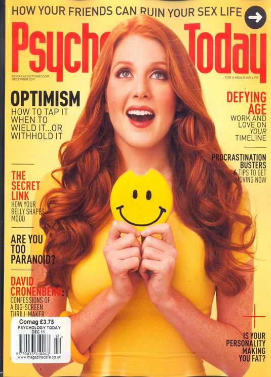
For this assignment, I chose to examine a good example of design, a Psychology Today magazine cover.
Rules
1. Image: According to the “Design Rules of Thumb” from this week’s readings, “A dynamic image that supports the copy certainly clarifies what you are trying to say.” The most prominent subtitle on the cover reads “optimism.” It is in a larger font, so obviously, it is an article that is of importance in the magazine. Therefore, the fact that the young woman is smiling and has taken a bite out of the happy face that she is holding speaks volumes. The image and the article on optimism are related. It clarifies that happiness has to do with optimism.
2. Image: The rules of thumb state that the image serves to break up “the layout so the reader has opportunities to absorb the information. The image breaks up the page and creates two clear columns of text. This makes it all easier to read and absorb.
3. Image: The rules advise not to use color images indiscriminately. The color is used quite purposefully in this image. The woman is wearing yellow, which “Graphic Design Basics” says is related to optimism, a topic covered in the magazine.
4. Layout: The rules of thumb state that large, bold display type should be used to create focus. The topics of the articles optimism and defying age are larger and bolder than the topics of other articles because they are of importance.
5. Layout: The rules of thumb state that consistency helps “the reader recognize, identify, and comprehend different types of information.” Consistency is created with the bold and non-bold pattern. Since the topics of the articles are in bold and their description are not, it makes it easy for the readers to understand the information.
6. Audience: The rules of thumb state that there should be “good visual separation between the words and the background.” The orange and black words stand out nicely against the yellow background.
7. Audience: The rules of thumb state that the designer should “provide visual breaks and rest spots.” Both the negative space and the image give the readers a break.
8. Audience: The rules of thumb state that the designer should also “consider the cultural differences of (the) audience.” Since this magazine is written for western readers, it designed to be read from top to bottom, left to right.
9. Audience: The rules of thumb state that the background shouldn’t be complicated. The background has no images and is one color. Its simplicity allows the reader to focus on the image and the text.
10. Audience: The rules state, “People will not attempt to read poorly organized and designed pieces.” Because the magazine cover is designed well, the audience might be more inclined to purchase and read this magazine.
Assignment 2:
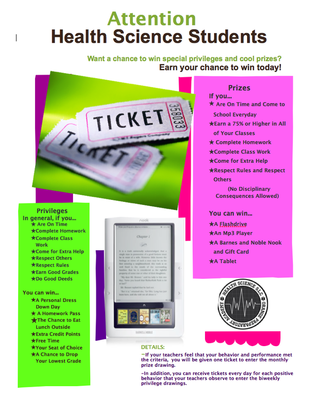
I chose to revise a flyer that I made to announce an incentive program our small learning community instituted last year. I definitely committed some of the layout sins defined in chapter four of White Space is Not Your Enemy!
Version One:
My confession:
1. Sin Number 8: Trapped Negative Space
I have negative space everywhere! I have space between around the photo of the tickets, the photo of the Nook, and our logo.
2. Sin Number 9: Busy Backgrounds
I know that, technically, I did not use a busy background, but I might as well have. There’s just way too much going on here. It definitely lacks clear focal points. Your eyes jump all over the place when looking at it.
3. Sin Number 11: Bad Bullets
This sin hit home when I read it because I know that I do this all the time. I always use those cutesy bullets. This time they’re stars.
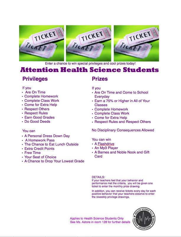
Revised Version:
My rationale:
1. First, to tackle the problem of negative space, I had to start over and move everything around. I started with the photo. Since the visual is the “eye entry point into (the) layout” (Golombisky and Hagan, 23) I moved the visual to the top of the flyer.
2. Second, to clean up the busyness, I decided to create columns. This would chunk the text as was my original intention, and it would create obvious focal points.
3. I made the text “Enter a chance to win special privileges and cool prizes today!” my cutline.
4. I changed my bullets from stars to the classic bullets.
5. I moved the Health Science SLC logo, my disclaimer, name, and room number to the bottom to function as a “tag”.
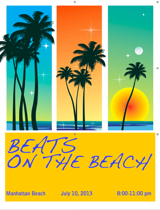
Assignment 3:
I chose to complete the second harmony exercise that focused on visual echo and created three versions of a poster that promoted a summer music festival. I played with echoing through color. Here is my rationale for each version.
Version One:
1. I chose to echo the blue-green color that appears in the first panel of the image and in the water that appears in all three panels.
2. For the font, I chose the orange for two reasons. First, it appears in the second column of the image. Second, according to the color wheel on page 208 of Design Basics Index, blue-green and orange complement one another.
3. According to the “Graphic Designs Basics” (link) reading, the color orange is associated with happiness. Therefore, I chose a font that is happy and whimsical, feelings usually associated with the beach.
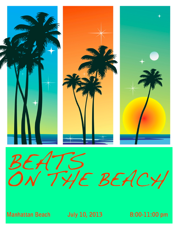
Version Two:
1. I chose to echo the sun’s yellow-orange color in the right-hand column.
2. For the font, I chose the blue-violet color that appears in the water in all three columns. Also, the color wheel referenced above states that blue-violet and yellow-orange complement one another.
3. Since violet is also associated with beauty, as is the beach, I decided to keep the font the same.
Version Three:
1. I chose to echo the seafoam green color in the right hand column.
2. For the font, I returned back to the orange from my original since blue-greens go well with orange.
3. Again, I chose to keep the font the same so that I could compare the three versions strictly based on my use of color and not be swayed for or against this version based on a different font choice.
My preference:
I prefer the first version. I might like this one better because the blue that I
used behind the font appears in all three columns of the photo. This might unite the two halves of my poster.
 Introduction: In “Skills and Strategies for E-learning in a Participatory Culture,” Simon Walker, Jill Jameson, and Malcolm Ryan discuss a learning theory called connectivism. George Siemens believes “that ‘connectivitism presents a model of learning that acknowledges the tectonic shifts in a society where learning is no longer an internal, individualistic activity.” Evidence of this theory is substantiated in the emergence of online communities and forums. The following are the forums and online communities that I will join to develop necessary skills as I design my Multimedia Montage Project. Classroom 2.o To start, I will join an online community called Classroom 2.0. In order to learn more about how to develop a participatory culture in my classroom as part of my Multimedia Montage Project, I need to learn more about how to incorporate social media and web 2.0 tools. This forum is a perfect place for me to gather tips and get feedback on how to use certain tools. What attracted me to this particular community is its high activity, varied 2.0 labs, and a live classroom where you could interact with teachers in real time. English CompanionAnother online community that I will join is called English Companion. As a language arts teacher, this site will help inform my instruction in general. More specifically, it will help support me in designing the content area specifics of my Multimedia Montage Project. I was thinking about designing my project around my upcoming unit on argument writing. I’m anticipating this unit with much apprehension because I am new to teaching this specific genre of persuasive composition. However, this year, for the first time, the state of NJ will be testing eighth graders on how to write an argument piece on the NJASK. Therefore, I must learn how to teach these new skills---FAST! Designing my project around this unit and participating in this community will be invaluable to my instruction. Thinkfinity-Online Tools for EducatorsThe Thinkfinity group that I will join is Online Tools for Educators. This group will assist me in learning how to use online tools and figure out how to work out gliches. One discussion thread already caught my eye because it speaks to a problem that I experience in the classroom. Members were discussing how to use Youtube even when it’s blocked. Getting immediate feedback on how to trouble shoot will definitely help me when designing my project, especially since many of the tools will brand new to me. Scribophile and Teen InkFinally, I will join Scribophile. Joining this online community of writers will help me learn what it feels like to actually post and share my work with the world. Steve Sabet actually pointed out a really important line in Elizabeth Daley’s “Expanding the Concept of Literacy” that I believe should shape the design of my Multimedia Montage Project. Daley states that students “want to be understood by their peers and by others who will see and experience their projects.” Far too often, my students write very meaningful pieces and the only person who gets to witness their brilliance is…me. This has to change going forward. I plan on having my students share their argument pieces on Teenink as part of my Multimedia Montage Project. However, before I suggest that they share their most prized thoughts with the world, I should see what it’s like for myself. I’ll do so with Scribophile.
Introduction:
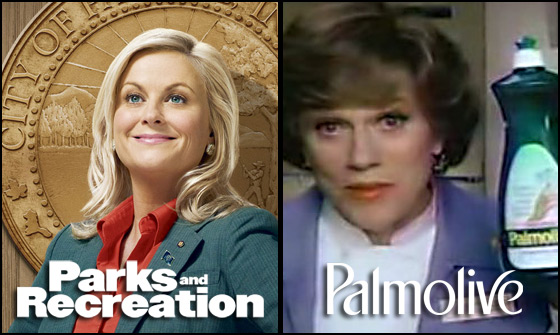
This post is a reflection on the vintage Palmolive commercial. In part, I chose this commercial because I assumed that, like many current commercials designed to sell cleaning products, the intended audience would be women. These commercials usually strike a chord with my feminist ideals and concern over gender inequalities. On a less serious note, I just watched an episode of Parks and Recreation that spoke to gender issues. Leslie Knope, the main character who is a city council member, was lobbying for more female representation in government jobs. One scene shows Leslie conducting a gender equality meeting, and ironically enough, ALL of the people who were sent to represent their department were male. A member comically praises her for the refreshments and tells her that she could leave the meeting. At any rate, I knew that like this episode of Parks and Recreation, the Palmolive commercial would have me thinking about gender, and therefore, I was immediately drawn to view it and analyze its messages.
Analysis:
What is the purpose of this video? What version of reality is it selling?
The purpose of this commercial is to convince women to purchase the dish detergent, Palmolive. It aims to convince the consumer that unlike other dish detergents that dry out your skin, Palmolive would moisturize your hands as you clean the dishes. It hopes to sell the reality that you don’t have to look like a mess just because you’re cleaning one up. You can still maintain your beauty and femininely soft hands while washing the dishes.
Audience:
Who is the intended audience of this video? Through whose eyes or perspective is information conveyed? Why?
Like I presumed, the intended audience is women. More specifically, one might even assume that the intended audience is married and the spouse responsible for doing household chores since the advice-giver, the manicurist who advises her client to use Palmolive and even has her soak her hands in it during the manicuring process, assumes that her client is married. However, since society and the media also sell the idea that most females hope to one day meet their Prince Charming and marry, we can assume that it also targets all females who hope to eventually become a wife.
The commercial’s message is conveyed through the eyes of two characters, a manicurist and her client. The former is Madge, a raspy-voiced, middle-aged, warm and humorous manicurist who uses Palmolive at work to soak and soften the cuticles of her clients’ nails. The other actress portrays her client, a beautiful, doe-eyed, younger woman who has dry hands. Both are beautiful, feminine women who are perfect for conveying the commercial’s message and sell the reality of beauty and household-chore-efficency.
More specifically, since it is a commonly held belief that one becomes wiser with age, Madge is suited to sell this product to her client and the audience because she is older, and inherently more knowledgeable. Her client, who is younger, married, and beautiful, is suited to sell the product because she is the one with the need to clean while maintaining her beauty. The producers might have assumed that when the young client is convinced of the product, the audience would ultimately be swayed as well to switch over to Palmolive.
Representation:
How are the people/figures in this video portrayed? Why do you believe they have been singled out? Whose voices are not being represented in this text?
Since the commercial takes place in a nail salon, the audience might infer that the women are concerned with beauty. They are both wearing make up, jewelry, and their hair is done perfectly. Naturally, it is no surprise that these women are concerned over how soft their hands are as well.
They are portrayed as romantic yet faithful since both of Madge’s jokes in the commercial include a reference to romanticism. When her client asks her about why she became a manicurist, she jokes that one of the reasons was the romance of it. At the end of the commercial, when the client attests that she’s “simply in love” with the dishwashing fluid that Madge recommended two weeks ago, Madge responds. “What, does your husband know about this?”
They are singled out because the advertisers hoped to sell their product to the romantic women who share the same concerns of these two women: a clean home, beauty, and romance/marriage.
There are many groups who are left out in this commercial like minorities, males, and anyone younger than twenty something and older than fifty something. Yet, even among the advertiser’s intended audience, there is a group of women left out: those who are not responsible for cleaning their home, concerned with beauty, or interested in romance.
Design:
From the perspective of a video producer, discuss what you think are some of the most important design decisions used in creating this ad. Why do you think this specific medium was used to market this product?
The design decision to have the commercial take place in a nail salon was key to appealing to a woman’s concern with beauty and femininity. If the tagline “softens hands while you do dishes” originated before this commercial, the selection of the nail salon as the setting was perfect. What better venue is there to showcase dry hands and its remedy than the nail salon?
Using a video/commercial as the medium was a smart choice for this ad-campaign because it allowed the personality of Madge, the beautiful, knowledgeable, yet wise-cracking manicurist to sell the product through her personality. Something about the light-hearted authority with which Madge speaks makes you want to believe that 1. you should care about whether or not your hands are soft and 2. Palmolive is the dish detergent you should use. Madge’s authority would not be communicated across any other medium quite as well.
Summary:
Although gender norms have become less rigid since this commercial was filmed, advertisers still reinforce gender stereotypes. For instance, commercials for cleaning products still target the female audience. There’s no doubt that commercials, and the media in general, reflect societal norms, but it must not go unnoticed that they also reinforce them. Without even realizing it, our ideas about our identities and how we should behave are shaped as viewers. Personally, as a female consumer of media, I continually monitor whether I am “buying into” the female reality sold by the Leslie Knopes of television or the current day Madges.
As an educator, I know that it is my job to help students develop visual and text literacy so that they evaluate both the superficial and embedded messages in the media. Students must learn to evaluate these messages so that they begin the self-reflective process of determining who they want to be, how they want to act, and what their beliefs are rooted in exactly. Is it a philosophy of thought? Or is it the way the media stereotypes in order to sell a product or concept? Overall, I know that I must do my part to not only bridge the student achievement and global achievement gaps, but other kinds of divisions like those inherit in gender inequality.
|


 RSS Feed