Assignment 1:
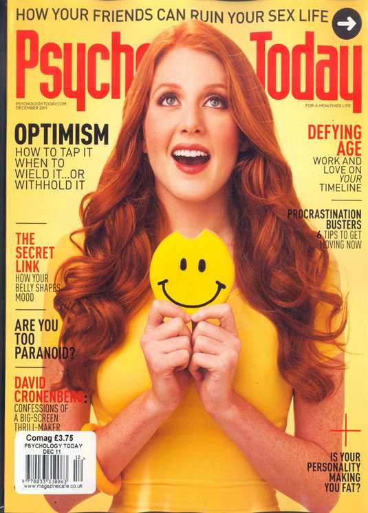
For this assignment, I chose to examine a good example of design, a Psychology Today magazine cover.
Rules
1. Image: According to the “Design Rules of Thumb” from this week’s readings, “A dynamic image that supports the copy certainly clarifies what you are trying to say.” The most prominent subtitle on the cover reads “optimism.” It is in a larger font, so obviously, it is an article that is of importance in the magazine. Therefore, the fact that the young woman is smiling and has taken a bite out of the happy face that she is holding speaks volumes. The image and the article on optimism are related. It clarifies that happiness has to do with optimism.
2. Image: The rules of thumb state that the image serves to break up “the layout so the reader has opportunities to absorb the information. The image breaks up the page and creates two clear columns of text. This makes it all easier to read and absorb.
3. Image: The rules advise not to use color images indiscriminately. The color is used quite purposefully in this image. The woman is wearing yellow, which “Graphic Design Basics” says is related to optimism, a topic covered in the magazine.
4. Layout: The rules of thumb state that large, bold display type should be used to create focus. The topics of the articles optimism and defying age are larger and bolder than the topics of other articles because they are of importance.
5. Layout: The rules of thumb state that consistency helps “the reader recognize, identify, and comprehend different types of information.” Consistency is created with the bold and non-bold pattern. Since the topics of the articles are in bold and their description are not, it makes it easy for the readers to understand the information.
6. Audience: The rules of thumb state that there should be “good visual separation between the words and the background.” The orange and black words stand out nicely against the yellow background.
7. Audience: The rules of thumb state that the designer should “provide visual breaks and rest spots.” Both the negative space and the image give the readers a break.
8. Audience: The rules of thumb state that the designer should also “consider the cultural differences of (the) audience.” Since this magazine is written for western readers, it designed to be read from top to bottom, left to right.
9. Audience: The rules of thumb state that the background shouldn’t be complicated. The background has no images and is one color. Its simplicity allows the reader to focus on the image and the text.
10. Audience: The rules state, “People will not attempt to read poorly organized and designed pieces.” Because the magazine cover is designed well, the audience might be more inclined to purchase and read this magazine.
Assignment 2:
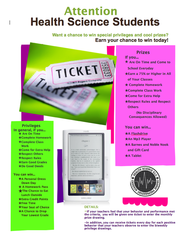
I chose to revise a flyer that I made to announce an incentive program our small learning community instituted last year. I definitely committed some of the layout sins defined in chapter four of White Space is Not Your Enemy!
Version One:
My confession:
1. Sin Number 8: Trapped Negative Space
I have negative space everywhere! I have space between around the photo of the tickets, the photo of the Nook, and our logo.
2. Sin Number 9: Busy Backgrounds
I know that, technically, I did not use a busy background, but I might as well have. There’s just way too much going on here. It definitely lacks clear focal points. Your eyes jump all over the place when looking at it.
3. Sin Number 11: Bad Bullets
This sin hit home when I read it because I know that I do this all the time. I always use those cutesy bullets. This time they’re stars.
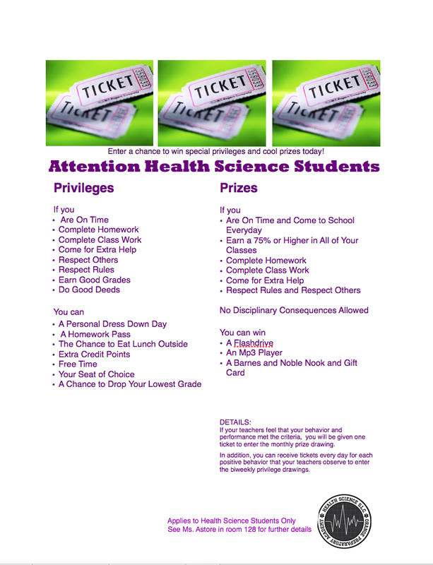
Revised Version:
My rationale:
1. First, to tackle the problem of negative space, I had to start over and move everything around. I started with the photo. Since the visual is the “eye entry point into (the) layout” (Golombisky and Hagan, 23) I moved the visual to the top of the flyer.
2. Second, to clean up the busyness, I decided to create columns. This would chunk the text as was my original intention, and it would create obvious focal points.
3. I made the text “Enter a chance to win special privileges and cool prizes today!” my cutline.
4. I changed my bullets from stars to the classic bullets.
5. I moved the Health Science SLC logo, my disclaimer, name, and room number to the bottom to function as a “tag”.
Assignment 3:
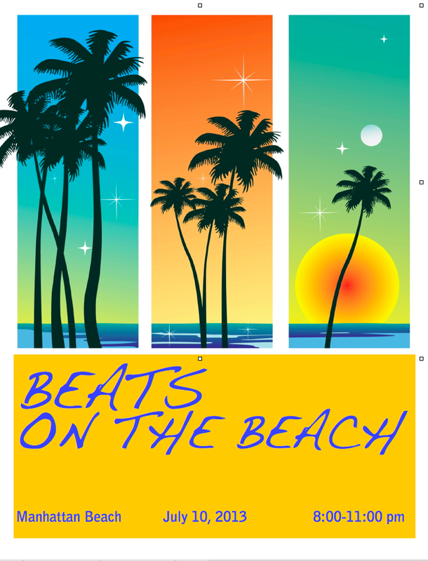
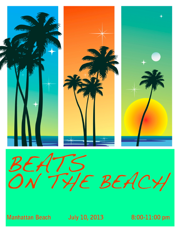
I chose to complete the second harmony exercise that focused on visual echo and created three versions of a poster that promoted a summer music festival. I played with echoing through color. Here is my rationale for each version.
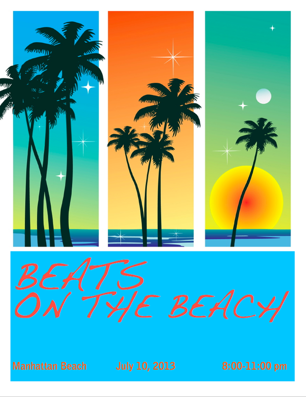
Version One:
1. I chose to echo the blue-green color that appears in the first panel of the image and in the water that appears in all three panels.
2. For the font, I chose the orange for two reasons. First, it appears in the second column of the image. Second, according to the color wheel on page 208 of Design Basics Index, blue-green and orange complement one another.
3. According to the “Graphic Designs Basics” (link) reading, the color orange is associated with happiness. Therefore, I chose a font that is happy and whimsical, feelings usually associated with the beach.
Version Two:
1. I chose to echo the sun’s yellow-orange color in the right-hand column.
2. For the font, I chose the blue-violet color that appears in the water in all three columns. Also, the color wheel referenced above states that blue-violet and yellow-orange complement one another.
3. Since violet is also associated with beauty, as is the beach, I decided to keep the font the same.
Version Three:
1. I chose to echo the seafoam green color in the right hand column.
2. For the font, I returned back to the orange from my original since blue-greens go well with orange.
3. Again, I chose to keep the font the same so that I could compare the three versions strictly based on my use of color and not be swayed for or against this version based on a different font choice.
My preference:
I prefer the first version. I might like this one better because the blue that I
used behind the font appears in all three columns of the photo. This might unite the two halves of my poster.
 RSS Feed