Awakening the Artist and Critic in All of us
 
Thanks to a classmate's recommendation for an online photo editing program, I used Fotoflexer for all of the exercises below. 

Cropping Exercise: page 193
Picture
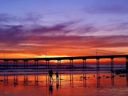
ORIGINAL Colorful Beach
This image reflects a beautiful beach scene. The focus seems to be on the colors in the sky and the bridge that divides the image. There's also a family on the beach in the lower portion of the image. This could be considered a focal point and is made clearer in the first cropped image below. 

Picture
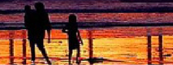
CROPPED Colorful Beach #1  
In this cropped version, I made the focal point the family on the beach. The fact that the family is off to the left draws your eye and makes you pay attention to them. 

Picture
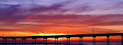
CROPPED Colorful Beach #2
I like this version that I cropped the most best because the balance is off. The bridge doesn't divide the image in half. Instead, it remains in the lower portion. The sky consumes the rest of the photo and is the undeniable focal point. 
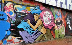
Picture
ORIGINAL Graffiti
I thought this image was really cool. There's so much visual energy and movement. It's so chaotic and that's part of what makes it interesting. 

Picture
CROPPED Graffiti
By cropping this section of the image, I drew attention to a part of the wall that might have been obscured otherwise. 

Picture
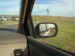
ORIGINAL Rear View Mirror
A lot of people take pictures of images in their rear view mirror, so I found this one that would be improved with a little cropping. 

Picture
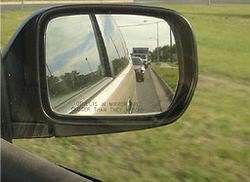
CROPPED Rear View Mirror
In the original image above, I found the part of the image that shows the interior of the car unnecessary. Therefore, I removed it and only focused on the rear view mirror. Now you can focus on the traffic reflected in the mirror. 

Picture
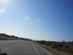
ORIGINAL Driving to Pebble Beach
This is a photo that I took as my friends and I were driving to Pebble Beach. It's difficult to find a focal point in this image. 

Picture
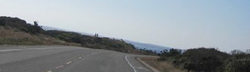
CROPPED Driving to Pebble Beach
By cropping the photo in this way, the view becomes more  panoramic. The focal point seems to be the end of the road or where the road leads, depending on how you look at it. 

Picture
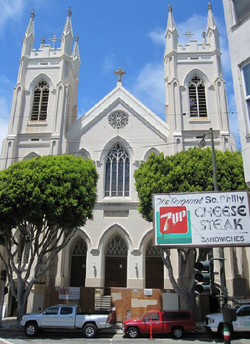
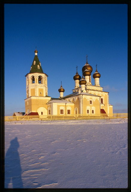
ORIGINAL Church in San Francisco
This is a photo I took of a church in San Francisco. 

Picture
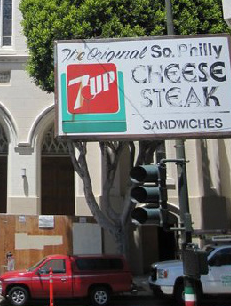
CROPPED Church in San Francisco
I cropped the photo to focus on the Philly Cheese Steak sign. I thought it stood out in the original, so cropping it in this way emphasized this ironic sign. Get it? Original Philly Cheese Steak in San Francisco? :)

Picture
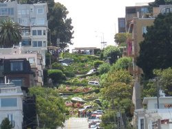
ORIGINAL Hill in San Francisco
Here is a photo I took of a famous landmark in San Francisco.

Picture
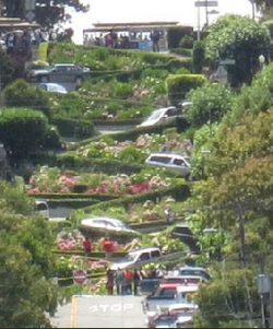
CROPPED Hill in San Francisco
By cropping it in this way, I removed the unnecessary buildings so that you could see the cars winding down this curious hill. 

Border Variation Exercise: page 197
Picture
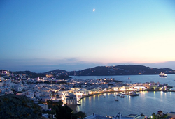
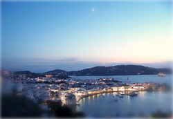
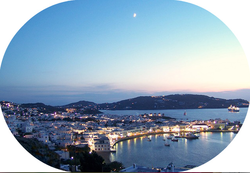
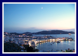
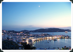
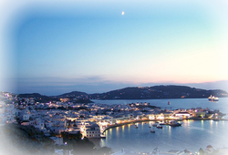
Looking through all of my photos from San Francisco made me think about my travels, and when I came upon this exercise, I thought about when I travelled to Mykonos, Greece. I couldn't find the photos that I took there, so I found a photo online. 

Picture
I used blurred edges for this border. It draws the eye inward. 

Picture
I used a circular border for this version. The shape echoes the contour of the coastline. 

Picture
I used a thick, dark blue border for this version. I chose dark blue to echo the dark blue tones in the mountains.

Picture
For this version, I used photo edges. It's fun, and it looks like it belongs in a scrapbook. 

Picture
This blurred border waters down the colors along the edges. It makes the picture look dreamy.

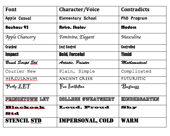
Conveyance Exercise: page 299
Picture
For shred, I used brush strokes to "shred" each letter.

Picture
For lightly, I used an airy font and placed the word in a cloud, which is perceived to be light. 

Picture
For atom, I used an image of an atom for the O.

Picture
Similarly, for brick, I used an image of a brick wall for the I.

Picture
For pillow, I used glittery, light blue letters. I associate light blue with the sky, dreaminess, and sleep. 

Picture
For XXL, I used bold capital letters. It screams extra large. 

 
Assignment #1: 
White Space is Not Your Enemy, pg 56 #2
Go online to visit the Library of Congress Prints & Photographs Reading Room at http://www.loc.gov/rr/print. Click around until you find several very different photographs you really like. Use the elements and principles of design to explain why you like the phones. 
Church of the Resurrection (1686-94), southwest view, Matigory, Russia
This photograph of the Church of the Resurrection is beautiful for many reasons. For one, I like the different types of lines created by the contrasting shapes in the church.  These contrasts are created by the cylinder of the tower, the brown bulbous shapes at the top, the points of the crosses, the triangular shapes of the roof, and the square sides of the building. Speaking of contrasts, the blue in the sky contrasts nicely as it meets with the tan color of the building and the stark white of the snow.  The texture created by the raised snow adds to the photo as well. 


Ida S. McKinley, full-length portrait, standing, facing front
 This photo of Ida S. McKinley is stellar for two reasons: texture and balance. The texture in the lace and print of her dress is gorgeous. There is an obvious texture in the wallpaper as well created by different variations of grey. Also, since both the dress and the wallpaper include texture, it is clear that texture might actually create a pattern in this image. Finally, there is a clear sense of asymmetrical balance in this photo.  She is centered, but there are a greater number of objects to her right. This is balanced by a greater amount of negative space on the wall to her left. The painting on the wall to her right also seems to be balanced by the train of her dress laying on the floor to her left. 


Where there's smoke there's fire

This print is interesting to me because of its inherit movement. Even though the focal point in the image seems to be the woman, my eye is immediately drawn to the swirling line of smoke coming from her cigarette.  While this seemed strange to me at first, the fact that this line creates movement justifies my gravitation toward it.  Also, I find the muted colors attractive. The cream of her skin and beige of her dress serve as a nice contrast to the black background against which she is set. 


Assignment #2:
Design Basics Index, pg 241 
Select a dozen or so contrasting fonts from your collection. Look them over and consider the "voice" that is conveyed through their characters.  For each font, come up with two words whose meaning is amplified when presented in that particular font.  Next, find a word whose meaning directly contradicts the look-and-feel of each of the fonts you have chosen. Note the humorous, sarcastic, intriguing and nonsensical conveyances that can be achieved through this kind of association. 

This was a really interesting activity.  I know that I select fonts with intention, but I never really tried to define the character/voice of each font. I certainly never thought about the character that it contradicts.  Who knew that font selection could evoke such emotion? 
 
Assignment 1:
For this assignment, I chose to examine a good example of design, a Psychology Today magazine cover. 

Rules

1. Image: According to the “Design Rules of Thumb” from this week’s readings, “A dynamic image that supports the copy certainly clarifies what you are trying to say.” The most prominent subtitle on the cover reads “optimism.” It is in a larger font, so obviously, it is an article that is of importance in the magazine. Therefore, the fact that the young woman is smiling and has taken a bite out of the happy face that she is holding speaks volumes.  The image and the article on optimism are related. It clarifies that happiness has to do with optimism.

2. Image: The rules of thumb state that the image serves to break up “the layout so the reader has opportunities to absorb the information. The image breaks up the page and creates two clear columns of text. This makes it all easier to read and absorb.

3.  Image: The rules advise not to use color images indiscriminately. The color is used quite purposefully in this image.  The woman is wearing yellow, which “Graphic Design Basics” says is related to optimism, a topic covered in the magazine.

4. Layout: The rules of thumb state that large, bold display type should be used to create focus. The topics of the articles optimism and defying age are larger and bolder than the topics of other articles because they are of importance. 

5. Layout: The rules of thumb state that consistency helps “the reader recognize, identify, and comprehend different types of information.” Consistency is created with the bold and non-bold pattern. Since the topics of the articles are in bold and their description are not, it makes it easy for the readers to understand the information. 

6.  Audience: The rules of thumb state that there should be “good visual separation between the words and the background.” The orange and black words stand out nicely against the yellow background. 

7. Audience: The rules of thumb state that the designer should “provide visual breaks and rest spots.” Both the negative space and the image give the readers a break. 

8. Audience: The rules of thumb state that the designer should also “consider the cultural differences of (the) audience.” Since this magazine is written for western readers, it designed to be read from top to bottom, left to right. 

9. Audience: The rules of thumb state that the background shouldn’t be complicated. The background has no images and is one color. Its simplicity allows the reader to focus on the image and the text. 

10. Audience: The rules state, “People will not attempt to read poorly organized and designed pieces.” Because the magazine cover is designed well, the audience might be more inclined to purchase and read this magazine. 


Assignment 2: 
I chose to revise a flyer that I made to announce an incentive program our small learning community instituted last year. I definitely committed some of the layout sins defined in chapter four of White Space is Not Your Enemy

Version One:

My confession:

1. Sin Number 8: Trapped Negative Space

I have negative space everywhere! I have space between around the photo of the tickets, the photo of the Nook, and our logo.

2. Sin Number 9: Busy Backgrounds

I know that, technically, I did not use a busy background, but I might as well have.  There’s just way too much going on here. It definitely lacks clear focal points. Your eyes jump all over the place when looking at it.

3. Sin Number 11: Bad Bullets

This sin hit home when I read it because I know that I do this all the time. I always use those cutesy bullets. This time they’re stars. 


Revised Version:

My rationale:

1. First, to tackle the problem of negative space, I had to start over and move everything around. I started with the photo. Since the visual is the “eye entry point into (the) layout” (Golombisky and Hagan, 23) I moved the visual to the top of the flyer.

2. Second, to clean up the busyness, I decided to create columns. This would chunk the text as was my original intention, and it would create obvious focal points.

3.  I made the text “Enter a chance to win special privileges and cool prizes today!” my cutline.

4. I changed my bullets from stars to the classic bullets.

5. I moved the Health Science SLC logo, my disclaimer, name, and room number to the bottom to function as a “tag”. 


Assignment 3:
I chose to complete the second harmony exercise that focused on visual echo and created three versions of a poster that promoted a summer music festival. I played with echoing through color. Here is my rationale for each version. 
Version One:

1.     I chose to echo the blue-green color that appears in the first panel of the image and in the water that appears in all three panels.

2.     For the font, I chose the orange for two reasons. First, it appears in the second column of the image. Second, according to the color wheel on page 208 of Design Basics Index, blue-green and orange complement one another.

3.     According to the “Graphic Designs Basics” (link) reading, the color orange is associated with happiness. Therefore, I chose a font that is happy and whimsical, feelings usually associated with the beach. 


Version Two:

1.     I chose to echo the sun’s yellow-orange color in the right-hand column.

2.     For the font, I chose the blue-violet color that appears in the water in all three columns. Also, the color wheel referenced above states that blue-violet and yellow-orange complement one another.

3.     Since violet is also associated with beauty, as is the beach, I decided to keep the font the same. 


Version Three:

1.     I chose to echo the seafoam green color in the right hand column.

2.     For the font, I returned back to the orange from my original since blue-greens go well with orange.

3.     Again, I chose to keep the font the same so that I could compare the three versions strictly based on my use of color and not be swayed for or against this version based on a different font choice. 


My preference:

I prefer the first version. I might like this one better because the blue that I

used behind the font appears in all three columns of the photo.  This might unite the two halves of my poster.


Picture
Introduction:
 In “Skills and Strategies for E-learning in a Participatory Culture,” Simon Walker, Jill Jameson, and Malcolm Ryan discuss a learning theory called connectivism.  George Siemens believes “that ‘connectivitism presents a model of learning that acknowledges the tectonic shifts in a society where learning is no longer an internal, individualistic activity.” Evidence of this theory is substantiated in the emergence of online communities and forums. The following are the forums and online communities that I will join to develop necessary skills as I design my Multimedia Montage Project. 

Classroom 2.o 
To start, I will join an online community called Classroom 2.0.

In order to learn more about how to develop a participatory culture in my classroom as part of my Multimedia Montage Project, I need to learn more about how to incorporate social media and web 2.0 tools. This forum is a perfect place for me to gather tips and get feedback on how to use certain tools. What attracted me to this particular community is its high activity, varied 2.0 labs, and a live classroom where you could interact with teachers in real time. 

English Companion
Another online community that I will join is called English Companion. As a language arts teacher, this site will help inform my instruction in general. 

More specifically, it will help support me in designing the content area specifics of my Multimedia Montage Project. I was thinking about designing my project around my upcoming unit on argument writing. I’m anticipating this unit with much apprehension because I am new to teaching this specific genre of persuasive composition. However, this year, for the first time, the state of NJ will be testing eighth graders on how to write an argument piece on the NJASK. Therefore, I must learn how to teach these new skills---FAST! Designing my project around this unit and participating in this community will be invaluable to my instruction.

Thinkfinity-Online Tools for Educators
The Thinkfinity group that I will join is Online Tools for Educators.

This group will assist me in learning how to use online tools and figure out how to work out gliches. One discussion thread already caught my eye because it speaks to a problem that I experience in the classroom. Members were discussing how to use Youtube even when it’s blocked. Getting immediate feedback on how to trouble shoot will definitely help me when designing my project, especially since many of the tools will brand new to me.


Scribophile and Teen Ink
Finally, I will join Scribophile.

Joining this online community of writers will help me learn what it feels like to actually post and share my work with the world. Steve Sabet actually pointed out a really important line in Elizabeth Daley’s “Expanding the Concept of Literacy” that I believe should shape the design of my Multimedia Montage Project. Daley states that students “want to be understood by their peers and by others who will see and experience their projects.” Far too often, my students write very meaningful pieces and the only person who gets to witness their brilliance is…me. This has to change going forward. I plan on having my students share their argument pieces on Teenink as part of my Multimedia Montage Project. However, before I suggest that they share their most prized thoughts with the world, I should see what it’s like for myself.  I’ll do so with Scribophile. 


    Vanessa Astore

    I am an eighth grade language arts teacher in Orange, New Jersey, and a graduate student at the Rutgers Graduate School of Education. This blog serves to share ideas about media literacy and design. 

    Archives

    April 2013
    March 2013
    February 2013
    January 2013

    Categories

    All