Assignment #1:
White Space is Not Your Enemy, pg 56 #2
Go online to visit the Library of Congress Prints & Photographs Reading Room at http://www.loc.gov/rr/print. Click around until you find several very different photographs you really like. Use the elements and principles of design to explain why you like the phones.
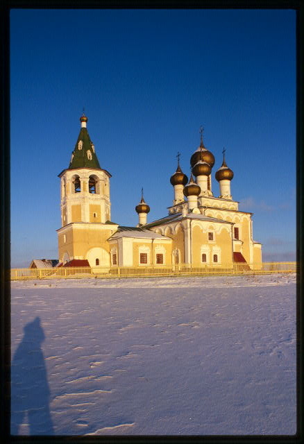
Church of the Resurrection (1686-94), southwest view, Matigory, Russia
This photograph of the Church of the Resurrection is beautiful for many reasons. For one, I like the different types of lines created by the contrasting shapes in the church. These contrasts are created by the cylinder of the tower, the brown bulbous shapes at the top, the points of the crosses, the triangular shapes of the roof, and the square sides of the building. Speaking of contrasts, the blue in the sky contrasts nicely as it meets with the tan color of the building and the stark white of the snow. The texture created by the raised snow adds to the photo as well.
This photograph of the Church of the Resurrection is beautiful for many reasons. For one, I like the different types of lines created by the contrasting shapes in the church. These contrasts are created by the cylinder of the tower, the brown bulbous shapes at the top, the points of the crosses, the triangular shapes of the roof, and the square sides of the building. Speaking of contrasts, the blue in the sky contrasts nicely as it meets with the tan color of the building and the stark white of the snow. The texture created by the raised snow adds to the photo as well.
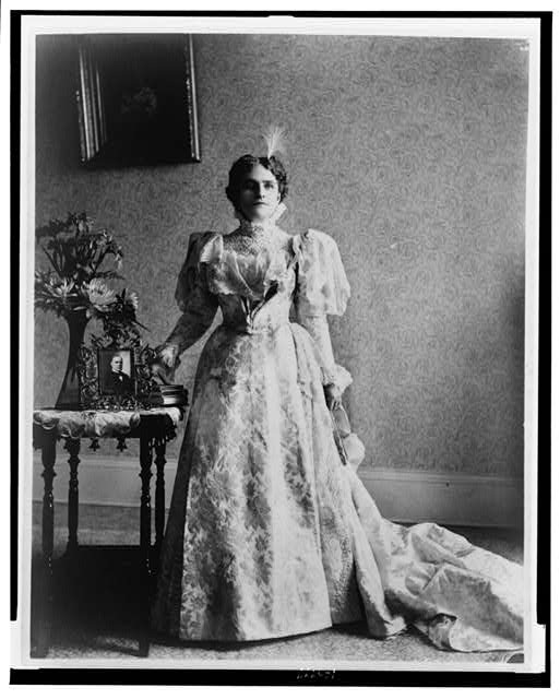
Ida S. McKinley, full-length portrait, standing, facing front
This photo of Ida S. McKinley is stellar for two reasons: texture and balance. The texture in the lace and print of her dress is gorgeous. There is an obvious texture in the wallpaper as well created by different variations of grey. Also, since both the dress and the wallpaper include texture, it is clear that texture might actually create a pattern in this image. Finally, there is a clear sense of asymmetrical balance in this photo. She is centered, but there are a greater number of objects to her right. This is balanced by a greater amount of negative space on the wall to her left. The painting on the wall to her right also seems to be balanced by the train of her dress laying on the floor to her left.
This photo of Ida S. McKinley is stellar for two reasons: texture and balance. The texture in the lace and print of her dress is gorgeous. There is an obvious texture in the wallpaper as well created by different variations of grey. Also, since both the dress and the wallpaper include texture, it is clear that texture might actually create a pattern in this image. Finally, there is a clear sense of asymmetrical balance in this photo. She is centered, but there are a greater number of objects to her right. This is balanced by a greater amount of negative space on the wall to her left. The painting on the wall to her right also seems to be balanced by the train of her dress laying on the floor to her left.
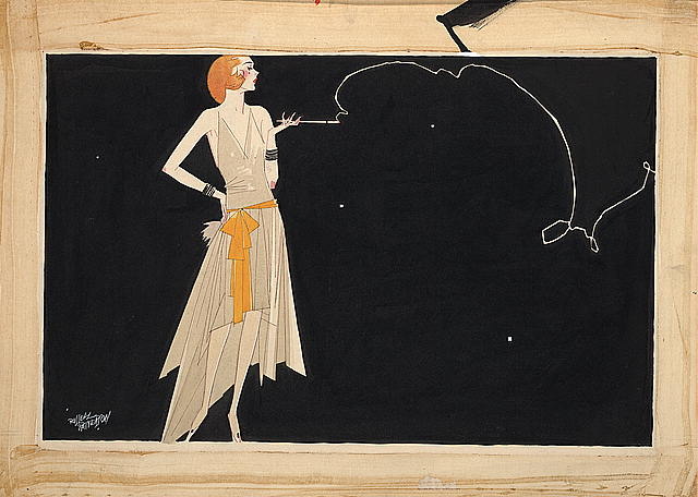
Where there's smoke there's fire
This print is interesting to me because of its inherit movement. Even though the focal point in the image seems to be the woman, my eye is immediately drawn to the swirling line of smoke coming from her cigarette. While this seemed strange to me at first, the fact that this line creates movement justifies my gravitation toward it. Also, I find the muted colors attractive. The cream of her skin and beige of her dress serve as a nice contrast to the black background against which she is set.
This print is interesting to me because of its inherit movement. Even though the focal point in the image seems to be the woman, my eye is immediately drawn to the swirling line of smoke coming from her cigarette. While this seemed strange to me at first, the fact that this line creates movement justifies my gravitation toward it. Also, I find the muted colors attractive. The cream of her skin and beige of her dress serve as a nice contrast to the black background against which she is set.
Assignment #2:
Design Basics Index, pg 241
Select a dozen or so contrasting fonts from your collection. Look them over and consider the "voice" that is conveyed through their characters. For each font, come up with two words whose meaning is amplified when presented in that particular font. Next, find a word whose meaning directly contradicts the look-and-feel of each of the fonts you have chosen. Note the humorous, sarcastic, intriguing and nonsensical conveyances that can be achieved through this kind of association.
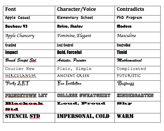
This was a really interesting activity. I know that I select fonts with intention, but I never really tried to define the character/voice of each font. I certainly never thought about the character that it contradicts. Who knew that font selection could evoke such emotion?
 RSS Feed